A paint color can look gentle on a small card and surprisingly strong across a whole wall. It may also change its apparent character beside a wooden floor, a cream sofa, or a bright white door. Sampling is useful because it brings those relationships into the decision before the room is committed. The trick is to make the test clear enough to compare, rather than covering the walls with unrelated patches until everything looks confusing. With a small shortlist and a consistent method, you can choose a color based on the room itself instead of a name, a screen image, or a hurried shop visit.
Begin with the surfaces staying in place
Identify the floor, major furniture, tiles, and woodwork that will remain. These elements establish the context for the paint. A color that works beside one oak finish may look different beside another, and a gray tile may contain a warm or cool undertone that becomes obvious only next to a sample. Gather small material samples if available, or photograph the room for reference while remembering that photographs alter color. Decide which fixed surface matters most. The wall paint should have a workable relationship with the room you own, not a hypothetical set of furnishings that would require another round of purchases.
Narrow the question
Choose a direction before selecting individual shades. Do you want the wall to recede behind artwork, make a room feel warmer, or provide a more defined background for pale furniture? These are practical visual goals. Avoid collecting twenty nearly similar colors without knowing what distinguishes them. Start with three or four candidates that answer the same question in slightly different ways. Keep their names and product details clear. A short comparison makes it easier to notice undertones and depth, while a large collection can make every choice look wrong simply because each neighboring color changes the impression of the others.
Use actual paint or reliable product samples
A screen image is a useful starting point but cannot establish how paint will look in your light. Obtain samples appropriate to the intended product and finish, and ask the supplier how closely the sample represents the final coating. Some sample products are not designed as a permanent finish. Follow their application guidance. If testing directly on a wall, consider how the patch will be prepared or covered later. Movable sample boards can be useful, provided the board and preparation are suitable for the coating. The aim is a consistent comparison, not a miniature project that introduces avoidable surface problems.
Make the samples large enough to read
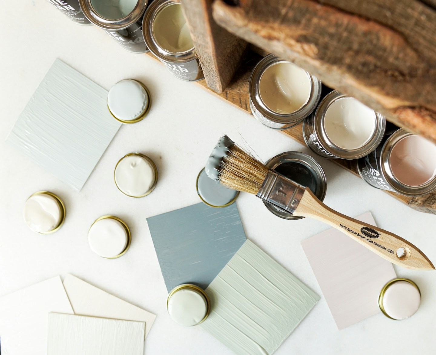
A tiny brush mark mainly shows the existing wall color around it. Prepare a sample large enough to see as a surface, following the product's recommended coats and drying time. Use the same method for every candidate. Label the back or edge so you do not lose track of similar shades, and record the finish as well as the color name. Keep borders neutral where practical. If several samples are placed together, leave space between them or view them separately, because adjacent colors can distort your judgment. Let each candidate be assessed against the actual room rather than only against its rivals.
Move the sample around the room
Place a movable sample near the window, in a shadowed corner, and beside the main fixed materials. Hold it vertically where the wall surface will be, rather than judging it flat on a table. Check it behind the sofa and near the door trim. A shade may work on one wall and appear too dull or too strong on another because the light is different. That does not automatically disqualify it; rooms naturally contain variation. You are looking for a result you can live with across the important viewpoints, not a color that appears perfectly identical in every position.
Check several times of day
Look at the samples in morning light, afternoon light, and under the lamps used at night. Include an ordinary cloudy period if possible. Record a brief observation rather than trying to remember every impression: warmer beside the floor, too blue under the bedside lamp, or comfortable at the desk. Your main use of the room matters. A dining room used mostly after sunset should not be judged entirely at noon. Avoid making a final decision when the sample is still wet or when unusual temporary lighting is in place. Let the test reflect the conditions in which the room will normally be experienced.
Consider sheen as part of the color
Matt, eggshell, satin, and other finish names vary between manufacturers. Ask about the specific product's appearance, cleaning guidance, and suitability for the room. A shinier finish can reflect light differently and reveal surface irregularities more clearly. A sample in one finish may not fully represent the same color in another. Where the distinction matters, test the intended system. Do not assume a more washable product is suitable for every surface or that one finish will hide all preparation problems. The wall's condition, product compatibility, and application quality remain important. Color selection and coating performance are related decisions, but they are not interchangeable.
Compare with trim and ceilings
Existing white woodwork may look creamier or cooler beside a new wall color. Put the sample near the door, skirting, and ceiling edge to see that relationship. If those surfaces are also being repainted, sample the combinations together and keep the number of moving decisions manageable. Choose one main relationship first, such as the wall against the floor, then refine the trim. A collection of almost matching whites can be more distracting than a deliberate difference. There is no rule that every room needs a stark white border. The useful question is whether the combination looks intentional in the room's actual light.
Avoid choosing by a photograph alone
Phone cameras adjust exposure and white balance, sometimes making two samples look much closer or farther apart than they appear in person. Use photographs to record placement and compare broad arrangements, but make the final color decision in the room. If asking someone else for an opinion remotely, explain the limitations and include the fixed materials in the image. Printed inspiration images have similar constraints. They show a color relationship under particular lighting and editing, not a guarantee of the same result in your home. Treat them as a guide to mood and proportion rather than an exact specification.
Leave one candidate in place
Once two or three options have been ruled out, live with the strongest candidate for several days. Remove the others so the remaining color is no longer judged as part of a crowded comparison. Notice it while doing ordinary activities, not only while standing in front of the sample trying to make a decision. If it continues to feel wrong beside an important surface, return to the brief rather than persuading yourself to accept it because of the name or trend. Keep notes about what failed. A useful negative result narrows the next choice and saves a much larger repainting job.
Record the final specification
Keep the brand, product range, color reference, finish, batch details where relevant, and application guidance with your home records. Buy according to the supplier's advice and estimate coverage based on the actual room and required coats. Follow safety and preparation instructions, especially on unknown old surfaces, and seek qualified help where needed. Save a clearly labeled sample for future comparison. The purpose of sampling is not to remove every uncertainty from decorating. It is to replace a guess with observations that matter: how the color sits with your materials, how it changes through the day, and whether you enjoy living beside it.
Have a correction or a question? Write to the Amenkingdj team.